Brand Design Trend in 2026: Imperfection, Emotion, and the End of Safe Minimalism
The brand design trend in 2026 is giving space to human imperfections in designs. It’s breaking polish and perfection. It’s injecting personality, again.
This year, creative direction is swinging toward expressive visuals, tactile color systems, and identity frameworks that feel unmistakably human. Coca-Cola’s Christmas ad to Vogue AI models in 2025 had made creative space more crammed with AI-dominated graphics. But 2026 poses a rediscovering phase.
Here are five trends shaping brand design in 2026 — and why they matter.
Human-led imperfection is the new luxury
AI walks in symmetry. It can generate gradients. It can balance layouts with mathematical precision. But it still struggles to replicate emotional irregularity — and that’s exactly what brands are leaning into.
In 2026, logos aren’t always perfectly aligned. Types aren’t always mechanically spaced. Campaign visuals carry grain, noise, collage edges, brush strokes, or rough textures. Because flaw signals presence.
The rise of hand-drawn typography, tactile textures, and layered design systems is a direct response to AI saturation. When everything looks frictionless, friction becomes distinctive.
Brands are intentionally designing slight inconsistencies into visual systems, controlled chaos that makes identity feel alive rather than engineered.
Expressive maximalism replaces safe minimalism
Minimalism dominated the 2010s and early 2020s. It worked because digital platforms demanded clarity. But in 2026, creative boundaries are expanding beyond safety.
The current Brand design trend in 2026 favors layered visuals, bold typography, and expressive composition. Brands are embracing visual density with intention.
Expect to see:
- Oversized typography
- Multi-layer color gradients
- Dynamic layout grids
- Playful visual interruptions
Design systems are becoming more elastic. Logos are no longer static marks; they flex, distort, animate, and respond to context.
The reason is simple: attention spans are short, and visual monotony dies fast in feed environments. Loud done intelligently beats quiet done safely.
The 2026 color palette: from cloud dancer to persimmon punch
The Brand design trend in 2026 comes straight from two influential signals: the Pantone Color Institute and search-driven predictions from Pinterest.
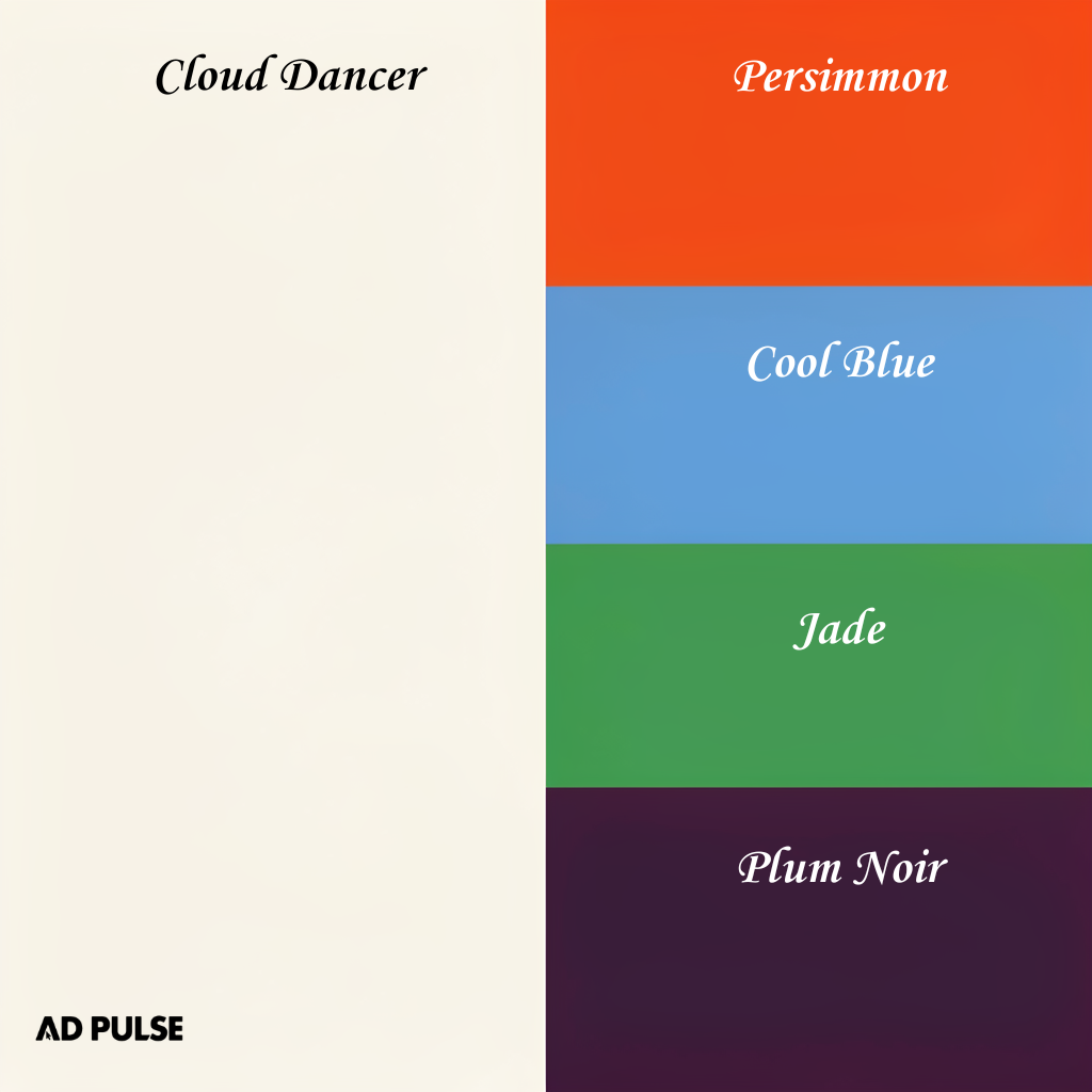
Pantone’s 2026 Color of the Year, Cloud Dancer (PANTONE 11-4201), is a soft, airy off-white. It reflects visual reset energy: space, clarity, and restraint. In branding terms, it works as a breathable foundation in an overstimulated digital world.
But Pinterest’s trend data tells a louder story. Rising shades include Persimmon (a bold red orange), Cool Blue, Jade, Plum Noir, and Wasabi; expressive, saturated tones that pop in feeds and signal personality.
2026 is about pairing calm neutrals with emotionally charged accents. Brands are building spacious base palettes and then disrupting them with sharp, high-impact color hits.
And that duality defines the Brand design trend in 2026.
Motion-first brand systems
Static identity may lose some ground when it comes to super-hyper visuals.
One of the strongest aspects of the Brand design trend in 2026 is motion as a core branding layer. Logos animate by default. Type shifts weight and expands across digital platforms. Visual systems respond to scroll, tap, hover, and swipe.
The reason is behavioral: brands live on screens, and they move.
Kinetic typography, micro-interactions, and subtle motion loops are no longer reserved for tech startups. Traditional industries such as finance, retail, and even luxury, are investing in motion branding to maintain relevance.
But there’s a caveat. Movement must carry meaning. Random animation reads gimmicky.
Cultural specificity over global generic
For years, global scalability has pushed brands toward a neutral, culturally safe design. But that neutrality often stripped away character.
In 2026, brands are embracing regional nuances. Local typography influences, culturally rooted color symbolism, and region-specific storytelling are becoming mainstream in identity systems.
There was a similar approach to Zohran Mamdani’s campaign visuals. Instead of relying on generic political branding, his team leaned into design cues drawn from immigrant-owned storefronts and community spaces across New York.
The color palettes echoed familiar retail signage often seen in Indian and Mexican neighborhoods, saturated reds, greens, yellows, bold contrast, and practical typography. The layouts felt closer to street posters and local shop boards than polished corporate templates.
Global reach doesn’t require global branding.
Brands are creating modular systems that adapt visually across markets instead of enforcing one homogenized look worldwide. This allows visual identity to reflect cultural context without losing cohesion.
This shift also pairs with authenticity expectations. Design must reflect lived understanding, not aesthetic borrowing.
What this means for creative strategy
The competitive edge in 2026 isn’t having access to better tools. Everyone has access to the same AI generators. The advantage lies in creative direction, taste, and emotional clarity.
Brand systems this year are:
- More expressive
- More tactile
- More animated
- More culturally aware
- More emotionally charged
Design is no longer just about visual consistency. It’s about resonance.
Consumers navigate algorithmic overload daily. When everything is optimized, the brands that stand out are the ones that feel intentional, imperfect, and unmistakably authored.
Cut to the chase
The defining Brand design trend in 2026 is more about bringing dynamics, imperfection, humanness, and maximalism. Brands that lean into expressive color, motion-first identity, layered maximalism, and cultural specificity will pay attention.